# temporal plots ----
# load ggplot2
library(ggplot2)
library(wesanderson)
# temporal attributes
pal <- wes_palette("Moonrise2", 20, type = "continuous")
# gantt chart of relative dates for perdiz arrow points
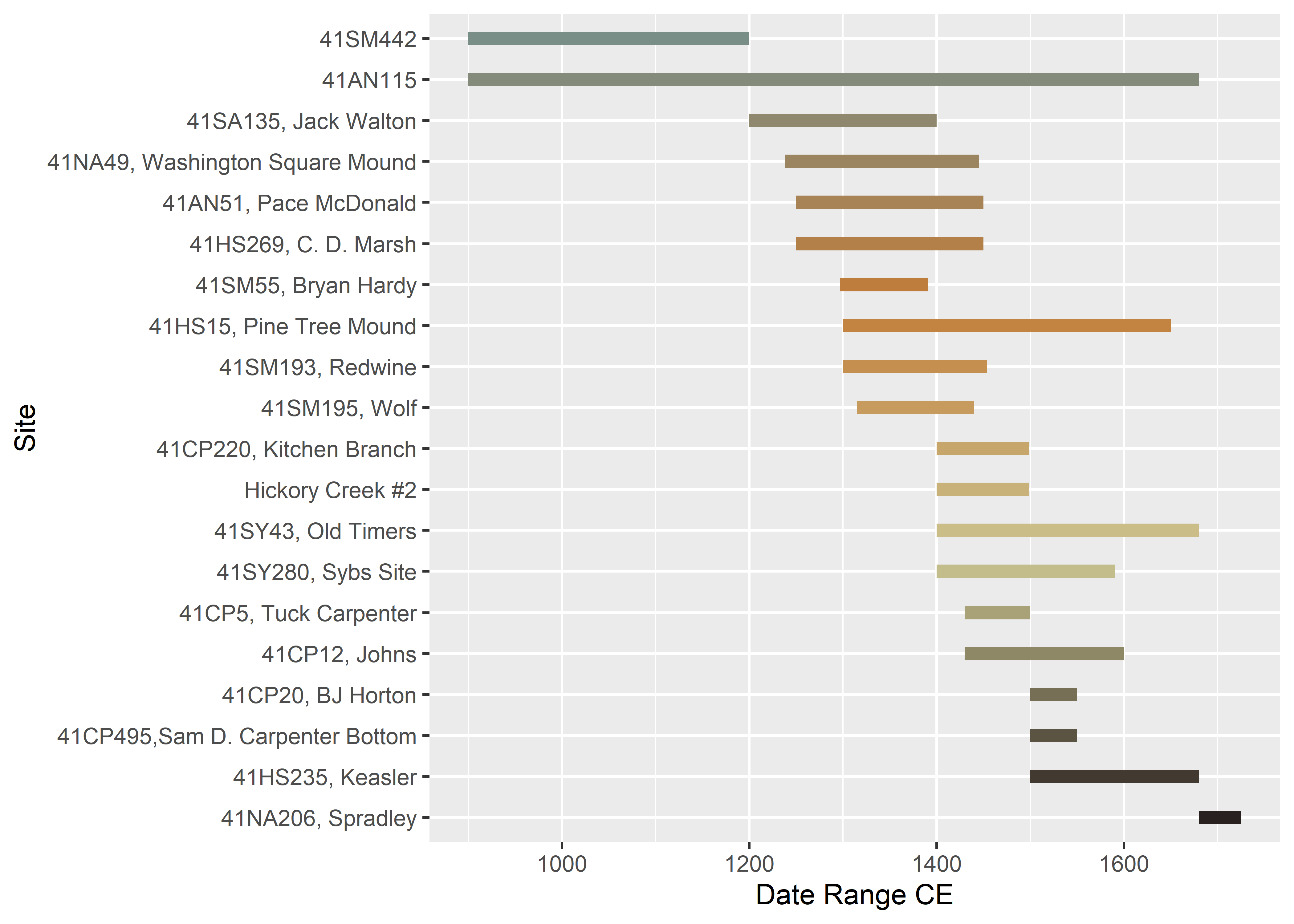
temp<-data.frame(Site = c('41SM442','41AN51, Pace McDonald','41AN115',
'41CP5, Tuck Carpenter','41CP12, Johns','41CP20, BJ Horton',
'41CP220, Kitchen Branch','41CP495,Sam D. Carpenter Bottom',
'41HS15, Pine Tree Mound','41HS235, Keasler','41HS269, C. D. Marsh',
'Hickory Creek #2','41NA49, Washington Square Mound',
'41NA206, Spradley','41SA135, Jack Walton',
'41SM55, Bryan Hardy','41SM193, Redwine','41SM195, Wolf',
'41SY43, Old Timers','41SY280, Sybs Site'),
Date_Range_CE = c(900,1250,900,1430,1430,1500,1400,1500,
1300,1500,1250,1400,1238,1680,1200,1297,1300,
1315,1400,1400), # in years CE
end = c(1200,1450,1680,1500,1600,1550,1499,1550,1650,1680,1450,
1499,1445,1725,1400,1391,1454,1440,1680,1590) # in years CE
)
# reorder types by beginning of relative date range
temp$Site <- factor(temp$Site, levels = temp$Site[order(temp$Date_Range_CE)])
# arrange figure
type.time <- ggplot(temp,
aes(x = Date_Range_CE,
xend = end,
y = factor(Site,
levels = rev(levels(factor(Site)))),
yend = Site,
color = Site)) +
geom_segment(size = 2.5) +
scale_colour_manual(values = pal) +
theme(legend.position = "none") +
labs(y = "Site", x = "Date Range CE")
# render figure
type.time